Gadget UI v 7.1.0 Overview
Gadget-ui is an open source widget library for use in Web applications. It is written in vanilla Javascript and contains components that can be called with minimal code. And older version of gadget-ui has a set of the same components written using jQuery; that version is deprecated and no longer in active development. The latest release of gadget-ui, v. 7.1.0, adds custom binding events for display components. The 7.0.0 version updated the library to use NodeJS to serve a simple test site to show the capabilities of the components in the library.
Loading the Library
In this release, you can call the library the traditional way by loading the JS file through a <script> tag:
<script src="/js/gadget-ui.js"/>
or a module loader like modlazy :
<script src='../bower_components/modlazy/dist/modlazy.min.js'></script>
<script>
    modlazy.load([ "/bower_components/velocity/velocity.js", '../dist/gadget-ui.css', "/bower_components/open-iconic/font/css/open-iconic.css" ], function(){
    console.log('All files have been loaded');
    });
</script>
More significantly, the library, as of v 6.0.0, allows you to load all or part of it through the ES module import command.
 import {floatingpane,constructor} from '/js/gadget-ui/dist/gadget-ui.es6.js';

 import {floatingpane,constructor} from '/lib/gadget-ui/dist/gadget-ui.es6.js';

 var fp1 = constructor( floatingpane,
   [ document.querySelector("#fp1"),
   {
     title : "My Floating Pane",
     enableShrink : false,
     top:100,
     left:100
   }] ) ;

 console.log( "Floating Pane" );

 // some HTML
 <div name="collapser" id="fp1" style="background-color: rgba( 255,255,255,.7);">
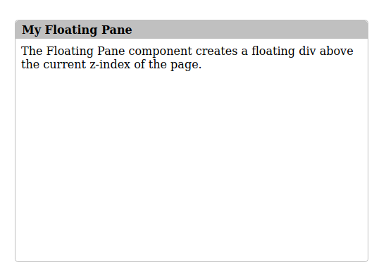
 The Floating Pane component creates a floating div above the current z-index of the page.

 </div>

 // CSS

 #fp1{
  width:500px;
  height:300px;
  overflow:hidden;
 }
Resulting in a FloatingPane object on the screen:

What’s In the Library
The library is divided into two sets of components - display and input.
gadgetui.display
- Bubble
- CollapsiblePane
- Dialog
- FileUploadWrapper
- FloatingPane
- Menu
- Modal
- Overlay
- ProgressBar
- Sidebar
- Tabs
gadgetui.input
- ComboBox
- FileUploader
- LookupListInput
- SelectInput
- TextInput
I started building the library several years ago when I was working on a project that needed some UI components I could not find in open source libraries. Over the years the library has grown and changed as my uses for it have changed. The Bubble component is no longer actively mantained and probably will be deprecated unless I get motivated to re-work it using a canvas element. The TextInput component, once something I thought would be more useful, seems dated, and the way it is built is unnecessary in the world of editable HTML elements enabled by modern browsers.
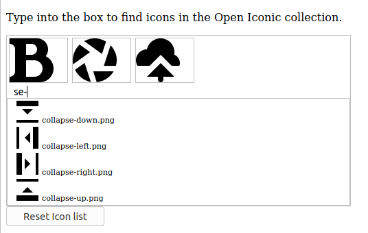
On the other hand, some of the components are as useful as ever. The FileUploader component enables drag and drop uploading, and this blog (and the test code) contains enough code in NodeJS and CFML to deploy functional upload components with very little new code. The LookupListInput uses typeahead to read from a local or remote datasource and displays basic text or allows for custom renderers to build lookup lists that show icons, images, or whatever you can imagine.

I maintain gadget-ui as a hobby. I haven’t done any work on it in the last year (as you can see from the lack of activity on GitHub), but I think it may be coming up on time to give it a refresh and maybe even build some new components. I built a set of examples into LacesIDE, and the easiest way to see them all in action today is to get LacesIDE and run it locally. I plan on putting up a version of the open source LacesIDE soon, so if you are interested in playing with gadget-ui, you might be able to see them work there.
