How Design Teams are Killing Usability on the Web
I've been using the Web since almost the very beginning, and never have I seen more problems with the usefulness and usability of corporate web sites than I have seen recently. Every new corporate re-branding/web site update/enhancement round seems to lead to more and more problems.
Today, I am looking at how design considerations have overtaken basic rules of functionality and usability for the Web. My example case today is the web site for Firestone Tires, www.firestonetires.com. Firestone, if you don't know, is an established leader in the United States in auto care. Firestone Tires focuses on sales and installation of automobile tires.
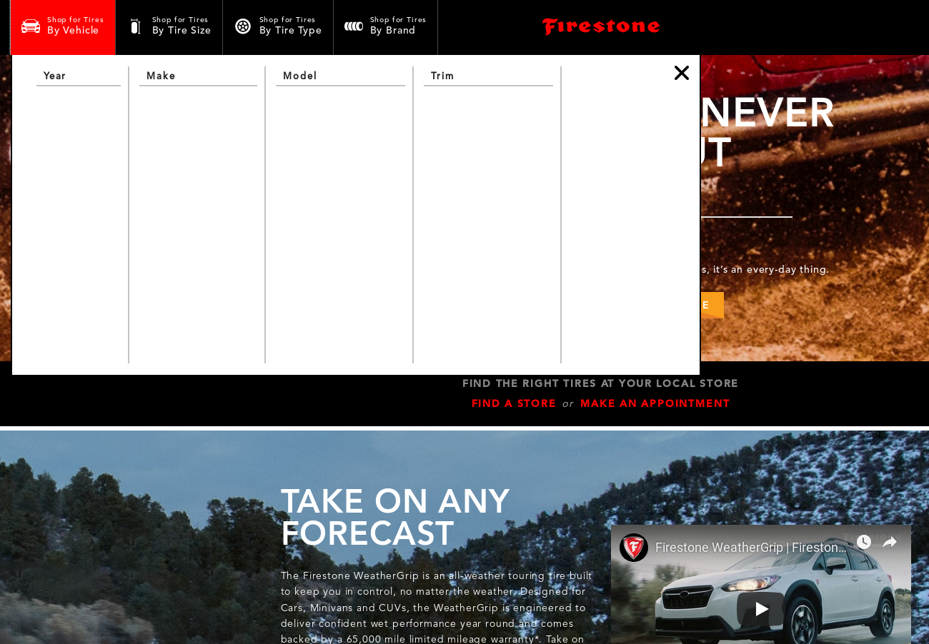
From the homepage of their site, you can shop for replacement tires for your car, in theory by one of several methods- vehicle, tire size, tire type, or brand. In my test on a mobile phone connection limited to 66 KBps (the Verizon "unlimited" throttle after 15 GB), I tried to load the homepage and shop for tires by vehicle. the results were less than spectacular.

As you can see, after the page loaded, the "select by vehicle" functionality was broken. What should happen is that a list of model years should appear on the left. Clicking on a model year should populate a list of vehicle makes, and so on. What happened instead was ... nothing. No functionality. Those are pretty pictures, though, right? And is that an embedded video? Oy. At least it isn't auto-playing.
Let's take a peek behind the scenes at the browser's Network tab to see how much stuff we just loaded.

So the page loaded, sort of, but after 1.5 MB of data transferred and another 1 MB + cached by my browser, the choose by vehicle function still isn't working. As I am sitting here writing this post, the page weight on the homepage is up to 5.78 MB and counting. What in the world is going on? A peek into individual requests reveals that the sites main.css style file is 456 KB. You read that right. Almost half a megabyte of style rules.
So what is going on? The site suffers from several problems, but the chief problem I see is that the site is trying to serve more than one purpose and it isn't succeeding. The marketing and design teams seem to have taken over the homepage and littered it with everything on their wish list. This site isn't just a marketing site, it is a practical ecommerce site for their customers to buy tires- which is the whole point of their business. I don't want to be a Debbie Downer about this, but this issue has to be costing them sales. Plenty of user studies have showed that users will bail on a site within seconds if something isn't working.
So how could Firestone Tires fix their web site and solve their issues? (BTW, don't feel too bad, Firestone peeps. Netflix has some similar issues, and they are really good at this stuff.) My first recommendation is that some sort of module/dependency loader should be used on the homepage, and script loading should be completed before large images, videos, and other assets are even attempted to be loaded. The baseline functionality of an ecommerce site should work, regardless of connection speed, regardless of asset loading for images and videos. It's time for software teams to re-assert themselves and remind the marketing people about the purpose of ecommerce on the Web.
